Dashboard Development
We have developed three dashboards at ITLab:
- CoWiz
- MLN-geeWhiz
- VideoScoop
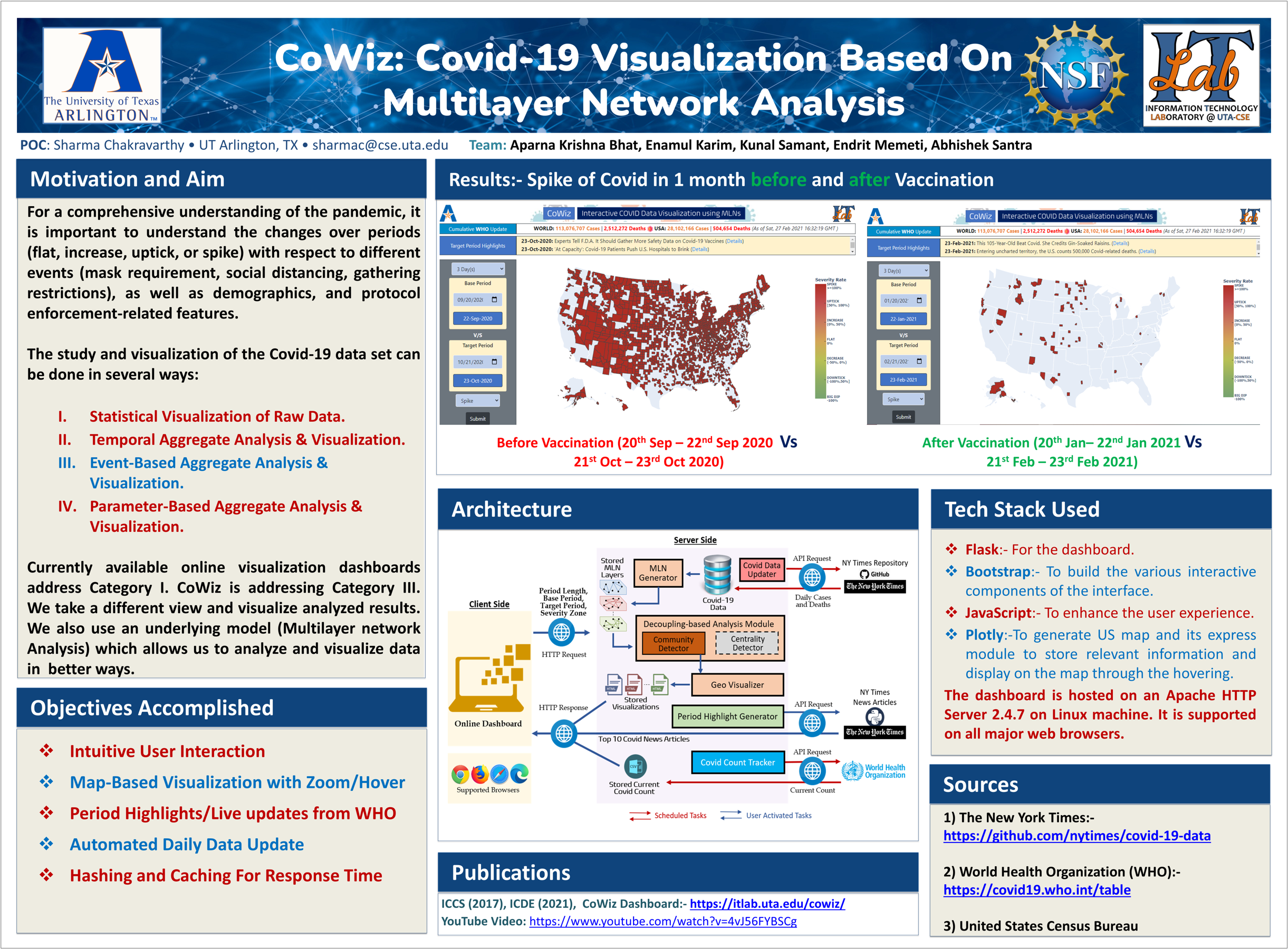
CoWiz
Covid Wizard (CoWiz) is a Covid-19 visualization dashboard built on multilayer network (MLN) analysis. While most dashboards display raw statistics such as daily cases, deaths, and tests, CoWiz emphasizes aggregate analysis - such as community detection and centrality - to provide deeper insight. For example, grouping counties by similar trends in cases, deaths, or hospitalizations requires MLN-based analysis rather than simple plotting. CoWiz integrates Covid-19 data with demographic and behavioral information (population density, education level, income, mobility, and purchasing patterns) at the county level across the U.S. It visualizes these relationships through a flexible, open-source dashboard that updates automatically as new data becomes available.
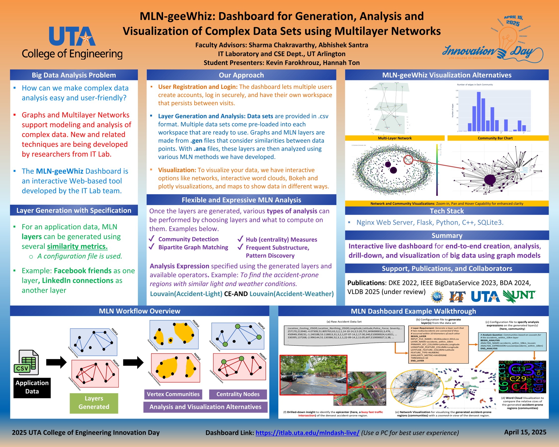
MLN-geeWhiz
The growing number of algorithms for complex data analysis makes it difficult for domain users to manage the full analytical workflow. A practical solution is to provide intuitive, interactive tools that support all stages -from modeling to advanced analysis and visualization - without requiring deep expertise. Multilayer networks (MLNs) have emerged as a powerful model for representing complex data with multiple entity types and relationships, going beyond the capabilities of simple or attributed graphs. MLN-geeWhiz is designed as an end-to-end, user-friendly platform that addresses this need. It enables users from diverse domains to analyze datasets, generate MLNs, apply state-of-the-art analysis techniques, and visualize results through an extensible and modular interface. Its architecture supports the seamless addition of new models and algorithms as they evolve.
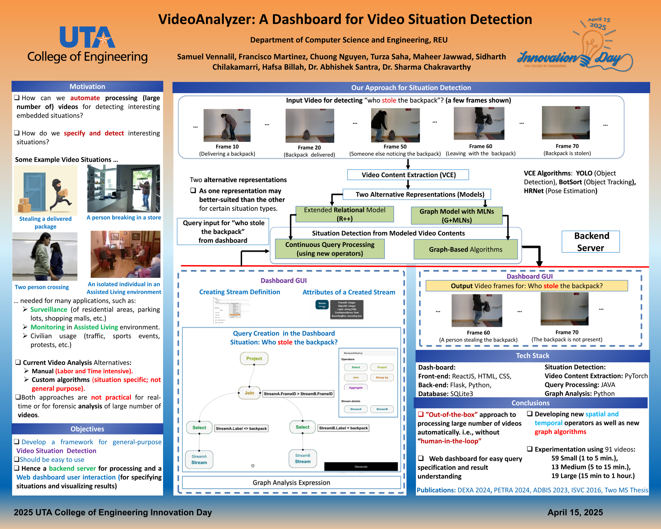
VideoScoop